Christmas Decor Theme & Color Scheme Planning Guide 2026
How to plan a cohesive whole-house Christmas theme and color scheme for 2026 — pick a palette, coordinate tree, lights, garland, and table, and shop it in the right order.
This article contains affiliate links. If you purchase through these links, we may earn a commission at no extra cost to you. Learn more.
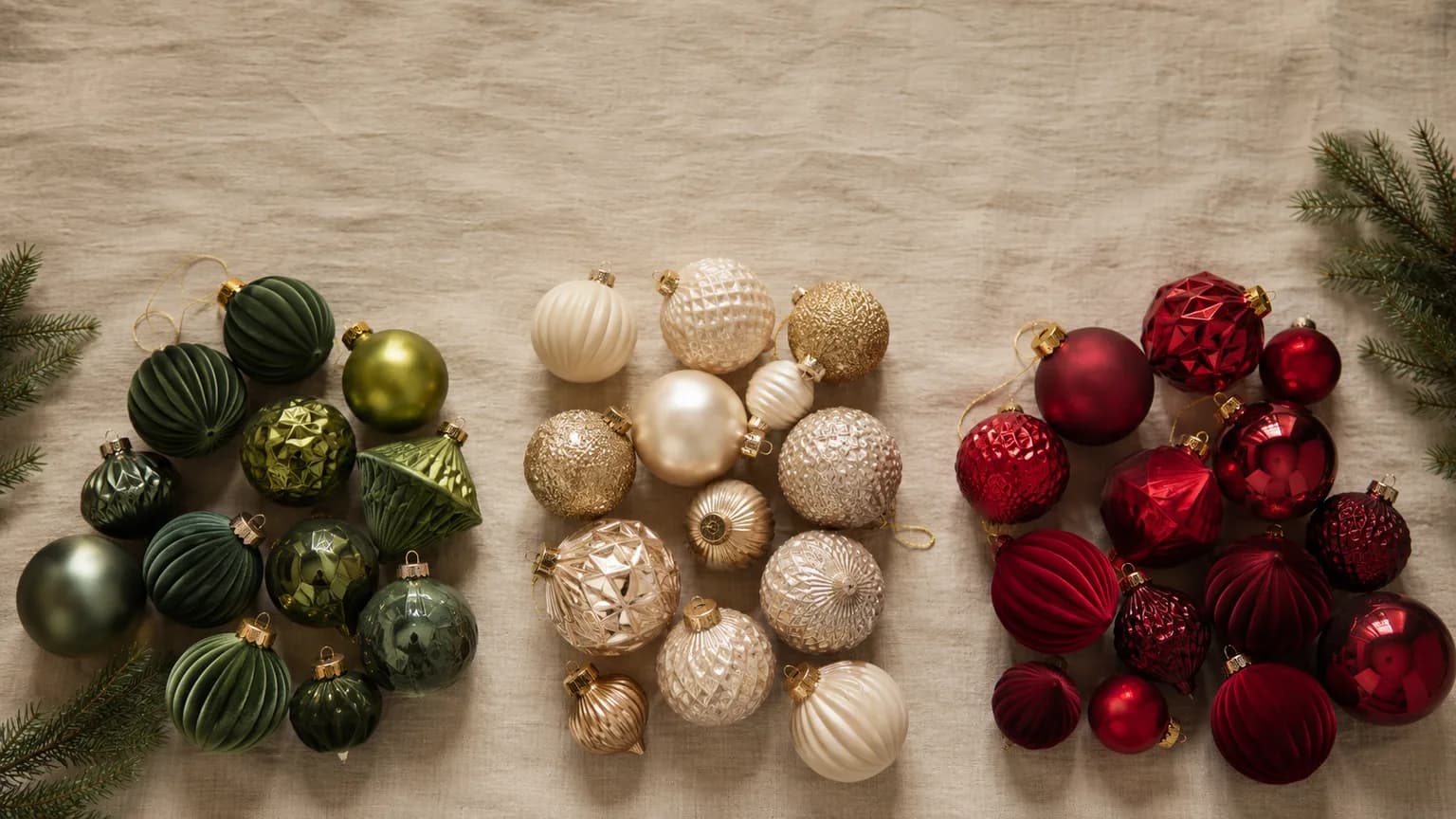
The difference between a home that looks casually decorated and one that looks intentionally styled almost always comes down to a single decision made before any shopping happens: committing to one theme and one color palette for the whole house. Designers often describe this as the "editing" step — deciding what to leave out is what makes the rest read as a deliberate look rather than a collection of ornaments accumulated over the years.
Most households decorate the opposite way. A few new ornaments get picked up in November, a garland is grabbed on a whim, a new tree topper joins whatever was already in the bins, and the result is a room full of pieces that each looked good on the shelf but don't speak to one another. The fix isn't spending more money — it's making the palette decision first, then letting every purchase answer to it. A cohesive scheme built from modest pieces almost always out-performs an expensive but mismatched one.
The best time to make that decision is now, in summer, months before the shelves fill and the good coordinated sets sell out. A planner who settles on a palette in July can shop the anchors deliberately, spread the cost across several months, and walk into the season with a clear shopping list instead of a cart full of impulse buys. This guide walks through choosing a scheme, building a cohesive palette, applying it room by room, and shopping it in the order that keeps everything coordinated.
Why Plan Your Theme in Summer?
Deciding on a theme in the off-season is not about being early for its own sake — it changes what you're able to buy and how much you pay for it. Three practical advantages stack up in a summer planner's favor.
The widest selection. Coordinated ornament sets, ribbon in specific colorways, matching garland, and themed table linens are produced in limited runs. The most popular palettes — and the pieces that tie a scheme together — are the first to sell out once the season starts. Locking in your palette early means you can secure the coordinated anchors while every option is still on the table, rather than settling for whatever is left in December.
Spreading the cost. A whole-house look built all at once in November is an expensive month. A planner who knows the palette by mid-summer can buy the tree in one month, the lighting in another, and layer in decor over several paychecks — the same total spend, far less painful timing.
Coordinating before pieces disappear. The hardest part of a cohesive look is matching. Getting ribbon, ornaments, and garland to share a palette is far easier when you can shop them together against a plan than when you're trying to match a color you bought last year and can no longer find. Planning early gives you the runway to order, compare in person, and reorder if a shade is off — long before the shipping windows tighten.
Popular 2026 Color Schemes
There is no single "right" palette — the best one is the one that suits your home's existing colors, your architecture, and the mood you want guests to feel walking in. Below are several schemes that decorators return to year after year, each with a distinct personality and the settings where it shines.
Classic Red & Green. The traditional Christmas palette, and enduringly popular for good reason. Warm reds against deep evergreen read instantly as "the holidays" and pair naturally with warm-white lighting, plaid, and natural greenery. This scheme is forgiving, family-friendly, and especially at home in cozy, traditional interiors with wood tones and a fireplace.
Winter White & Silver. Crisp, elegant, and a little glamorous. All-white and silver decor — frosted branches, mercury glass, crystal, and cool-white lights — creates a serene, snowy look that photographs beautifully and suits modern or minimalist spaces. It's a strong choice for open-plan rooms where you want the tree to feel like a sculptural centerpiece rather than a riot of color.
Gold & Champagne. Warm metallics for a rich, formal look. Gold, brass, and champagne tones feel opulent without being loud, and they flatter warm lighting and neutral rooms. This palette shines in more formal living and dining spaces and pairs well with an ivory or deep-green base.
Blush & Rose Gold. Soft, romantic, and current. Muted pinks and rose-gold accents give a gentler, contemporary take on the holidays that feels fresh rather than traditional. It works beautifully in lighter, more feminine interiors and layers naturally with white and cream.
Jewel Tones. Emerald, sapphire, and plum for a moody, luxurious effect. Deep saturated color reads as rich and dramatic, especially against dark walls or brass accents. Jewel tones suit maximalist decorators and rooms that can carry a bold statement — a velvet-and-brass living room, for instance, rather than an airy neutral one.
Modern Farmhouse Neutrals. Sage green, cream, natural wood, and muted greenery for an understated, organic look. This scheme leans on texture rather than color — burlap, wood-bead garland, cotton stems, and warm-white light — and feels calm and lived-in. It's a natural fit for homes already decorated in neutral, rustic, or farmhouse styles.
A useful test when choosing: look at the room you decorate most and pick the palette that already agrees with its walls, furniture, and undertones. A scheme that fights the room it lives in rarely looks as cohesive as one that extends what's already there.
Building a Cohesive Palette
Once you've chosen a general scheme, turning it into a palette that reads as intentional comes down to a simple formula that designers lean on constantly: a dominant color, a secondary color, and a metallic accent.
Dominant, secondary, accent. Pick one color to carry the look — this is what a guest registers first from across the room. Add a secondary color to give it depth and contrast. Then choose a single metallic — gold, silver, copper, or rose gold — as the accent that ties everything together and catches the light. Three notes is usually enough; a fourth often tips a cohesive scheme back toward the cluttered look you're trying to avoid.
The 60/30/10 idea. Interior designers often describe balanced rooms in roughly 60/30/10 proportions, and the same idea works for a holiday palette: about 60% of what the eye sees is the dominant color, about 30% the secondary, and about 10% the metallic accent. You don't need to measure anything — it's just a reminder to let one color lead rather than splitting everything evenly, which reads as busy.
Repeat the palette across rooms. The single biggest driver of a "whole-house" feel is repetition. When the same three notes show up on the tree, the mantel, the table, and the entryway, the eye connects the spaces even when the individual pieces differ. You don't need identical decor in every room — just the same palette, restated.
Ribbon and bows as the unifier. If there's one shortcut to cohesion, it's using the same ribbon everywhere. A single coordinated ribbon woven through the tree, tied on the garland, topping the wreaths, and finishing the gift wrap threads the entire house together for very little money. Buy it early, buy it by the roll, and buy more than you think you'll need — matching it later is the hardest thing to do once the season starts.
Applying the Theme Room by Room
A palette only becomes a whole-house theme when it shows up consistently from the front door to the dinner table. The goal in each space is not to duplicate the last one, but to restate the same three notes in a way that suits the room.
The tree (or trees). The tree is usually the anchor of the entire scheme, so it should carry the palette most completely — dominant-color ornaments in the majority, secondary color as contrast, the metallic scattered to catch the light, and the unifying ribbon woven through. If you decorate more than one tree, keep them in the same palette but let them vary in emphasis; a flocked entryway tree and a warm living-room tree can share colors while feeling distinct.
Mantel and garland. The mantel is a horizontal echo of the tree. Run garland that repeats the greenery and palette, tuck in the same ornament colors and metallic accents, and finish with the ribbon or bows used elsewhere. Stockings are an easy place to restate the dominant and secondary colors.
Wreaths. Wreaths carry the theme to doors, windows, and walls. Matching the front-door wreath's ribbon and accents to the interior scheme is what makes the look feel continuous from outside in, rather than like two unrelated decorating decisions.
Table setting. The holiday table is where the palette gets its most concentrated, up-close moment. Linens, napkins, chargers, and a centerpiece in the same colors turn a meal into part of the theme. Because the table is viewed closely, it's the place where texture and small metallic details pay off most.
Entryway. The entry sets the expectation for everything behind it. A console vignette, a bannister garland, or a small tree in the palette tells guests what the rest of the house will feel like. Keeping the ribbon consistent here is an easy, high-impact way to introduce the scheme.
Outdoor lighting. The exterior is the first impression, and coordinating it with the interior palette is what separates a planned home from a decorated one. Warm-white light pairs with almost every scheme; app-controlled color lighting lets you match a specific palette — cool white and blue for a winter-white look, or deep jewel colors for a richer one — and change it for other occasions the rest of the year. App-controlled smart color lights are a natural way to carry a theme's colors outdoors. For the whole-yard version of this — zoning the exterior, budgeting the power, and sequencing the install — see the outdoor Christmas display planning guide.
The consistent thread through all of it is the palette and, above all, the ribbon. When the same colors and the same bow keep reappearing, the house reads as one coherent idea.
Shop Your Theme in the Right Order
Once the palette is set, the order you buy in matters — buying the big anchors first protects the whole scheme, because everything else is chosen to coordinate with them. Layering decor before the anchors are decided is how mismatches creep back in.
1. Buy the big-ticket anchors first. The tree and the primary lighting are the foundation everything else answers to. Settle these before buying a single ornament. If you need a tree, start with the roundups of the best pre-lit artificial Christmas trees, and if you're unsure about size or style for your space, read how to choose an artificial Christmas tree first so the anchor is right.
2. Lock in coordinated lighting. Lighting sets the color temperature the whole palette lives in — warm white flatters reds, golds, and neutrals, while cooler and color-changing light suits winter-white and jewel schemes. App-controlled systems let one set of lights match different palettes and occasions across the year; see the best smart Christmas lights (app-controlled), and for a permanent exterior solution, the best permanent outdoor Christmas lights.
3. Layer in the decor to match. With the anchors and lighting decided, the rest is coordination — ornaments, ribbon, garland, wreaths, and table linens all chosen against the palette rather than on impulse. Because these are the pieces most likely to sell out in your specific colorway, buy them early:
- Coordinated ornament sets: shop ornaments on Amazon
- Wired ribbon by the roll: shop Christmas ribbon on Amazon
- Matching garland: shop Christmas garland on Amazon
- Coordinated wreaths: shop Christmas wreaths on Amazon
- Holiday table linens: shop Christmas table linens on Amazon
Buying in this order — anchors, then lighting, then decor — means every dollar spent later reinforces the look instead of competing with it.
Last updated: July 2026. Prices may vary on Amazon — check current pricing via the links above.
Frequently Asked Questions
How do I choose a Christmas color scheme for my whole house?
Start with the room you decorate most and pick a palette that already agrees with its walls, furniture, and undertones rather than one that fights them. Choose a dominant color, a secondary color, and a single metallic accent, then plan to repeat those three notes in every space. A common approach is to gather a few physical swatches — a ribbon, an ornament, a napkin — and set them side by side before committing, so you're matching real colors rather than remembered ones.
What are the most popular Christmas color schemes for 2026?
Enduring favorites include classic red and green, winter white and silver, gold and champagne, blush and rose gold, deep jewel tones like emerald and sapphire, and modern farmhouse neutrals built on sage, cream, and natural wood. None is objectively best — traditional interiors tend to suit red and green or warm metallics, while modern and minimalist spaces often look sharper in white-and-silver or neutral schemes.
Why should I plan my Christmas theme in summer?
Planning in the off-season gives you the widest selection before coordinated sets sell out, lets you spread the cost over several months instead of one expensive November, and gives you time to match ribbon, ornaments, and garland against a clear plan. It also means you shop deliberately from a list rather than making mismatched impulse buys once the season's rush begins.
What is the 60/30/10 rule for holiday decorating?
It's a guideline borrowed from interior design suggesting that roughly 60% of what the eye sees is the dominant color, about 30% the secondary color, and about 10% the metallic accent. You don't need to measure — it's simply a reminder to let one color lead rather than splitting everything evenly, which is what makes a scheme look busy instead of intentional.
In what order should I buy my Christmas decorations?
Buy the big-ticket anchors first — the tree and the primary lighting — because everything else is chosen to coordinate with them. Lock in coordinated lighting next, since it sets the color temperature the palette lives in. Then layer in ornaments, ribbon, garland, wreaths, and table linens to match. Buying in this order keeps every later purchase reinforcing the look instead of clashing with it.
How do I make my decorations look cohesive without buying everything new?
The fastest route to cohesion is repeating one palette and, above all, one ribbon across every room — the same bow on the tree, garland, wreaths, and gift wrap ties the whole house together for very little money. You don't need identical decor everywhere; restating the same three colors, even with pieces you already own, is usually enough to make separate spaces read as one intentional theme.
Get our Christmas gear picks
Holiday deal roundups and updates when our top picks change.
No spam, ever. Unsubscribe anytime.
Sources & Methodology
Methodology: ChristmasGearHQ guides are researched on an expert-verification model. Specifications, dimensions and capability claims are taken from the manufacturer's own published material and, where available, independent published reviews, and are attributed in the text to the source that published them. Where two sources disagree, we say so and name both rather than picking one. We do not make first-person hands-on testing claims.
Prices, sellers and availability are read from the live product page and move on their own schedule — confirm the current figure through the links above before buying. Edited by Nicholas Miles, Chief Editor. Corrections: contact us.
More Guides
- Holiday PlanningPrime Big Deal Days 2026 for Christmas: What to Buy Now and What to Hold for Black Friday
- Holiday PlanningChristmas Savings & Budget Plan 2026 — Start Saving This Summer
- Holiday PlanningWhen to Buy Christmas Decorations — 2026 Shopping Timeline
- Christmas TreesBest Cat-Proof Christmas Trees 2026: Cat Tree Towers, Tree Fences and Flat-Back Trees